THE ENTIRELY TRICKY TASK OF CHOOSING A BOOK COVER
NEVER EVER JUDGE A BOOK BY ITS COVER...
ALWAYS JUDGE A BOOK BY ITS COVER...
IT'S WHATS BETWEEN THE COVER WHICH COUNTS...
With the publication date of my second book, 'The Last Letter', looming, now comes the trickiest part of publishing. The cover design.
Writing the book was easy. Editing the book was fairly easy. Choosing a cover for the book? Not at all easy.
So far, we are up to draft #3, and I'm hopeful draft #4 will be the final version.
Before signing a contract with Accent Press, I'd paid for a cover design through the website Design Crowd. To this day, I still love their version.

The winning Design Crowd cover
Accent Press advised that this image wouldn't work when its shrunk down to Amazon icon size. So, after signing my first publishing contract with them, they proposed this cover:

It was a little more gruesome than I'd anticipated...
After some discussion, revolving around a cover with less blood, we agreed on the fantastic cover which now appears in your bookcases.

And now we move onto the process of choosing a cover for my second book, 'The Last Letter'.
Without giving too much of the plot away, the story takes you back to New Zealand, India and England. With a splash of Roman antiquities, Maori carvings, and a hint of Spitfire pilots in WWII.
My publisher is based overseas, so understandably their knowledge of the appropriate use of Maori imagery wasn't as up with the play as mine. Especially when there are hundreds, if not thousands, of stock images of Maori carvings and taonga (treasure) available on the Internet. And while I did adore the first cover they designed, after taking advice from two trusted Maori colleagues, I had to veto the use of the Maori carving, which in essence, is the depiction of someone's ancestor, a high ranking chieftain by the looks of it.

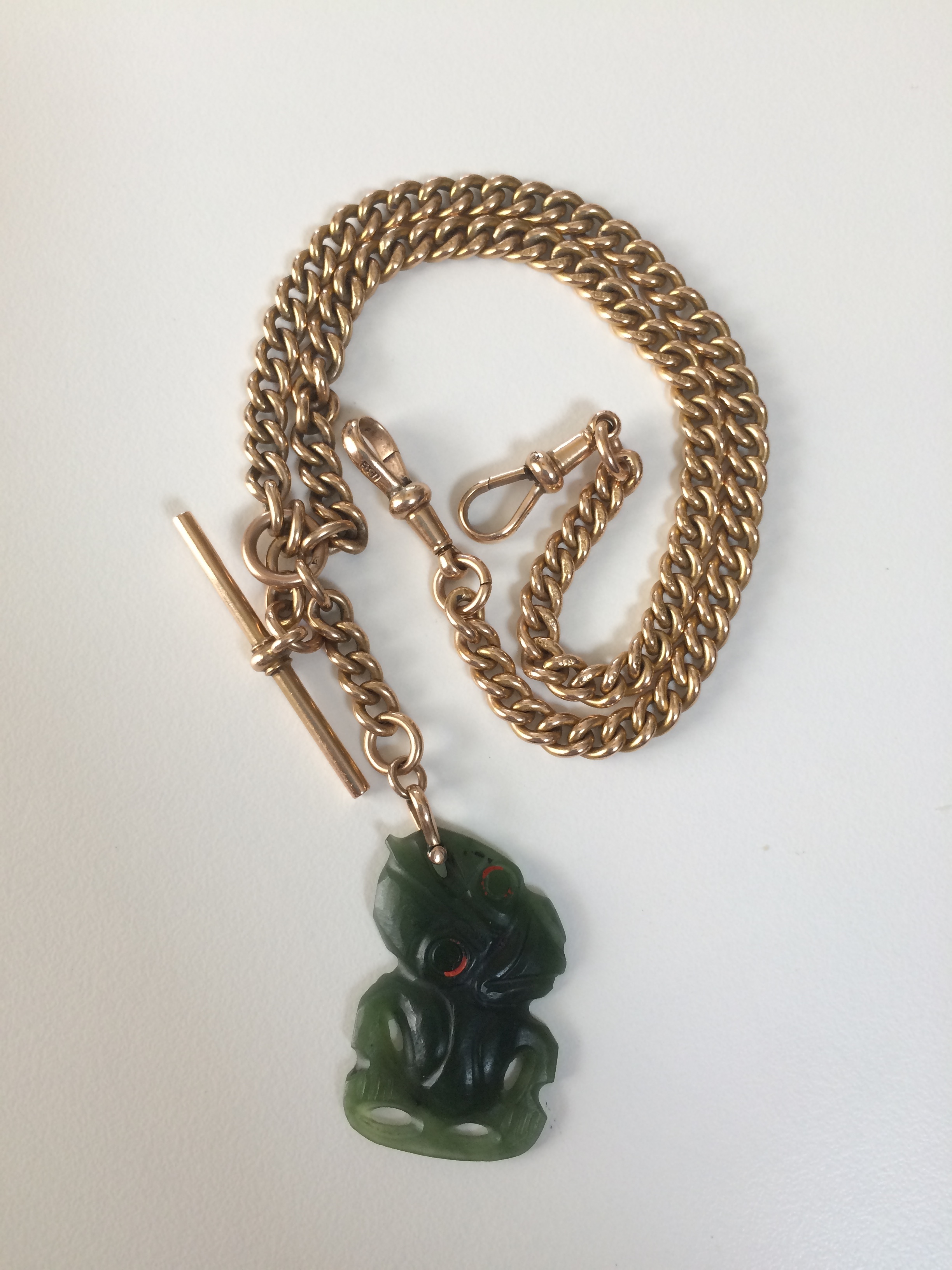
So then we toyed around with the idea of a greenstone necklace, a Roman statue, pocket watches. I've now realised that pocket watches are synonymous with time slip novels, and adorn almost every cover out there. The designers at Accent Press then came up with an image of a hei tiki (tiki), which I loved.
After much discussion on Facebook and Twitter, it was roundly agreed that the balance of the two images was out. Do you agree?

Draft #2 of the cover for 'The Last Letter'. We all agreed that the balance was out.
So it was sent back to the designer, who tweaked the colour balance, removed an errant watermark off the tiki's hand, and deleted a random full stop at the end of the tagline. This was the version that came back:

Draft cover #3 for 'The Last Letter'
Almost there. Almost, but not quite.
I compared a printout of the draft cover, with the cover of 'Fifteen Postcards', and was struck with the fact that my author name wasn't in the same position. Which, to me, looked peculiar. What do you think? Is this just my OCD, or do you agree that the author name needs to be in the same place on both books, and on the future third book in the series? So it was sent back for more tweaking!
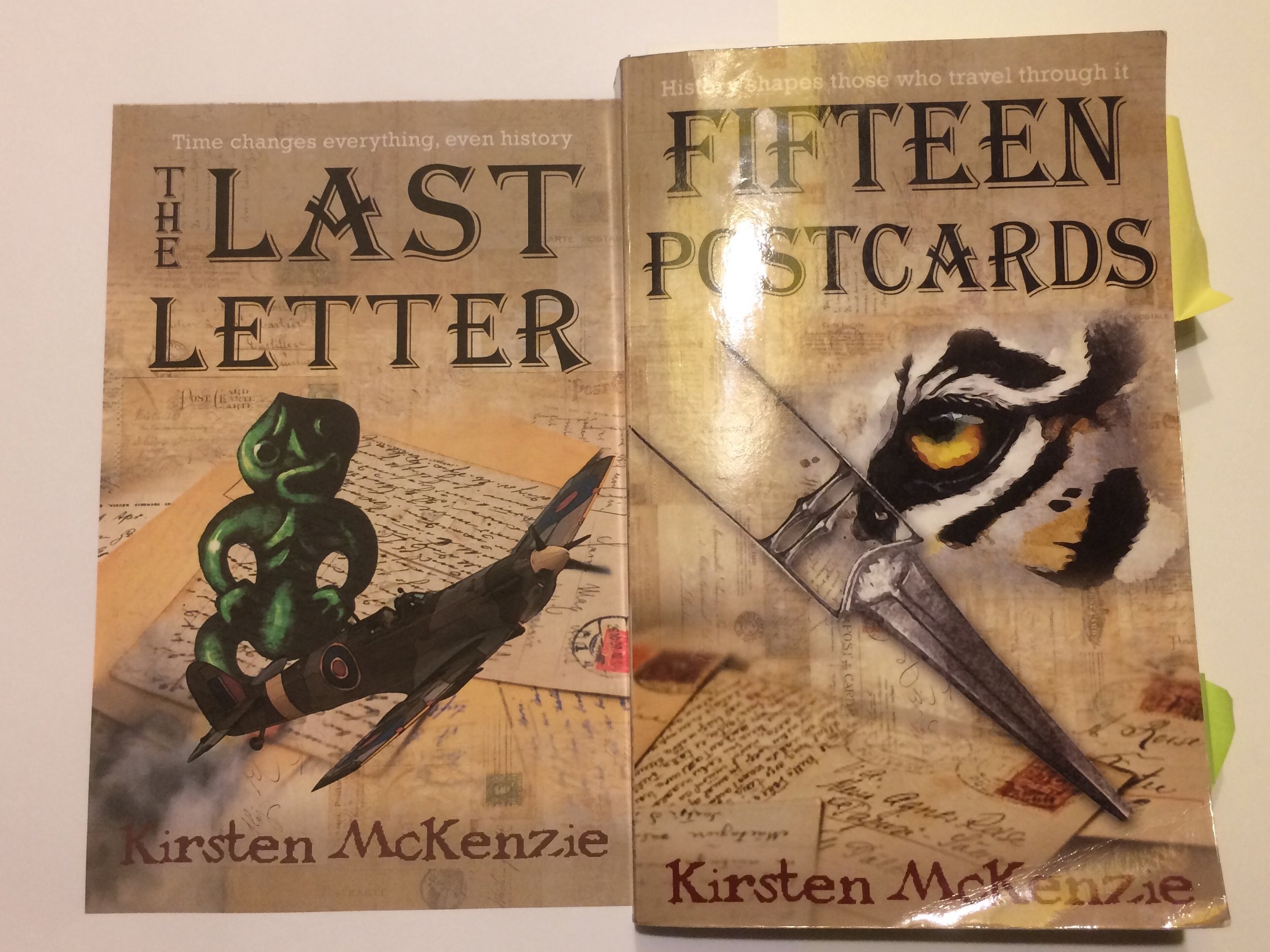
Comparison of draft cover #3 and the final cover of Fifteen Postcards. Note the placement of the author name.
My publisher is in the business of selling books, and they know which covers work, and which covers don't. I'm hoping to have the finalised cover back this coming week, ready for 'The Last Letter' to be released on the 1st of November, my birthday...
So there you have it. Choosing a cover is by far the hardest part of this whole process. So if you'll excuse me, I'll go back to writing another book in the meantime!